•Opening the Vertical Profile Window
•Enhancing the Vertical Profile
The Vertical Profile is a vertical trend or line chart that displays one or more parameters measured at a specified depth, location, and time. There may be multiple, independent horizontal axes, depending on how many analytes are selected.
The Vertical Profile can display data from two different data sources:
•DT_BASIC_RESULT
•DT_SAMPLE/DT_TEST/DT_RESULT
If the DT_BASIC_RESULT contains records for the current facility, then the data from that table will be displayed by default. If the DT_BASIC_RESULT table is empty for the current facility, then the data from DT_SAMPLE/DT_TEST/DT_RESULT will automatically display. If you have basic result data but want to view data from DT_SAMPLE/DT_TEST/DT_RESULT, hold the <Shift> key while clicking the Vertical Profile button to skip basic results and display DT_SAMPLE/DT_TEST/DT_RESULT.
When DT_BASIC_RESULT or DT_SAMPLE/DT_TEST/DT_RESULT is displayed, The data mappings are:
Data Source |
Location |
Analyte |
Dates |
DT_BASIC_RESULT |
sys_loc_code |
cas_rn |
result_date |
DT_SAMPLE/DT_TEST/DT_RESULT |
dt_sample.sys_loc_code |
dt_result.cas_rn |
dt_test.analysis_date |
Data Source |
Y axis |
X axis |
Y unit |
X unit |
DT_BASIC_RESULT |
depth |
result_value |
depth_unit |
result_unit |
DT_SAMPLE/DT_TEST/DT_RESULT |
dt_sample.start_depth |
dt_result.result_numeric |
dt_sample.depth_unit |
dt_result.result_unit |
Notes: •The null DT_SAMPLE.START_DEPTH or DT_RESULT.RESULT_NUMERIC (i.e. non-detects) is excluded in charting. •There are no unit conversions. •Depth or start_depth is present as negative values in Y axis and sorted in descend in charting. |
Opening the Vertical Profile Window
Click the Vertical Profile (located in the Tools group on the Home tab).
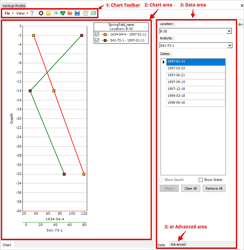
The Vertical Profile window consists of 1: Chart Toolbar area, 2: Chart Area and 3: Data area or Advanced area.

Creating a Vertical Profile
The following steps will create a vertical profile of an analyte on a day at a location.
1.Select the desired Location using the Location: drop-down menu of the Data area.
2.Select an Analyte using the Analyte: drop-down menu.
3.Select Dates: (to select multiple, non-adjacent dates, hold down the Ctrl key while making the selections).
4.Click Show.
To display a vertical profile of another analyte of the location in the same chart, select the new analyte and its desired dates; click Show.
Enhancing the Vertical Profile
Users have almost complete control over the look of the vertical profile and can:
•Change the line type, color, and appearance.
•Modify axis labels and lines.
•Customize the header, and much more.
This tutorial does not attempt to exhaustively describe every feature that can be customized, but rather provides easy-to-follow instructions for some of the more commonly used customizations.
Changing the Depth Axis
To change the depth axis so that its labels are spaced out further and represent a greater distance:
1.Click the Advanced tab and then click the Y axis area (the left side of the chart).
2.Find Range and extend it, edit Interval to a larger number and hit Enter.
Changing the Line Appearance
To change the appearance of one line on the graph:
1.Click the Turn On/Off Current Chart Editor button of the chart toolbar to display chart editor.
2.Click Edit Style button of the chart editor and select a desired series to open Chart Series Style window.
3.Click Border.
4.Change Width.
5.Click OK.
To change the line color:
1.Click the Turn On/Off Current Chart Editor button of the chart toolbar to display chart editor.
2.Click Edit Style button of the chart editor and select a desired series to open Chart Series Style window.
3.Click Interior.
4.Change BackColor.
5.Click OK.
6.Note that you may want to change the color of X axis of the selected series to the same BackColor. To do so, select PrimaryXAxis > LineType > ForeColor and change the color.
To change the line style:
1.Click the Turn On/Off Current Chart Editor button of the chart toolbar to display chart editor.
2.Click Edit Style button of the chart editor and select a desired series to open Chart Series Style window.
3.Click Border.
4.Change Dash Style.
5.Click OK.
Changing the Header
To change the header of the graph:
1.Click the chart area to open Advanced tab.
2.Find Titles and click (...) next to (Collection) to open ChartTitle Collection Editor.
3.Click Add to add a ChartTitle into Members.
4.Enter your title into Text of ChartTitle properties.
5.Click OK.
Note that clicking Add multiple times adds more headers or subheaders. Select a title and click Remove to remove the title.
Changing the Legend
To change the legend:
1.Click the chart area to open Advanced tab.
2.Expand Legend under Legend.
3.To remove check boxes from the Legend, change VisibleCheckBox from True to False.
4.To change the legend title, click the right side of Text to open the title editing box and make changes to the title.
5.To change the background color, expend BackInterior and click BackColor and selecting a color from the drop-down.
6.To change the spacing between the objects in the Legend, change the value for Spacing.
Adding/Changing Annotations
See Add Images and Annotations of XY Charts.
Adding a Company Logo
See Add Images and Annotations of XY Charts.