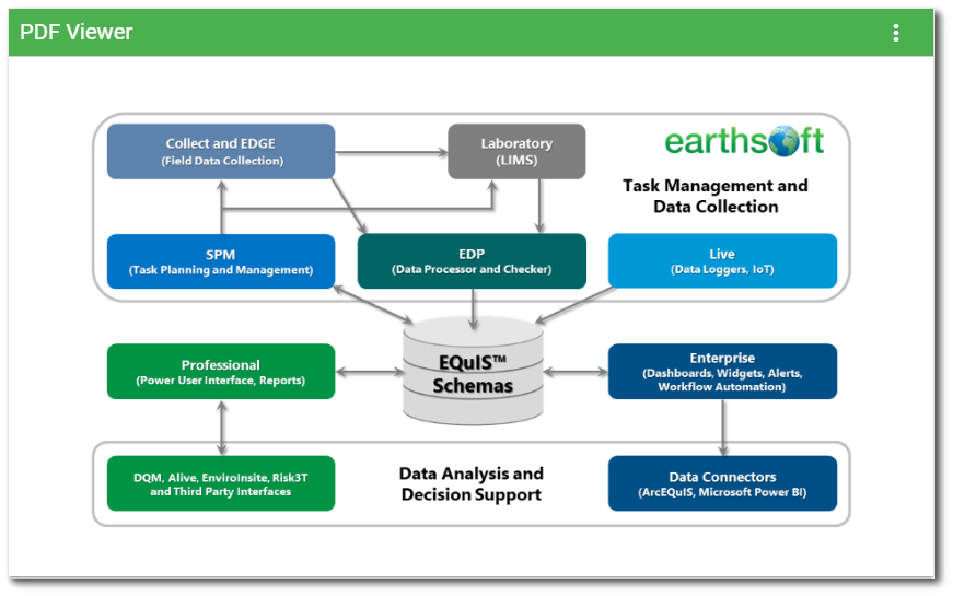
The PDF Viewer Widget is used to view and scroll through entire Portable Document Format (PDF) files. A vertical scrollbar is enabled on the widget when the length of the PDF file exceeds the height of the widget. When the widget is added to a dashboard, a translated message is displayed informing the user to select a PDF file to view in the Widget Editor. See Widget Editor section below for instructions on how populate the PDF Viewer widget.

Note: The PDF Viewer widget requires that the FILE_TYPE field in both the DT_FILE and RT_FILE_TYPE tables be populated with ".pdf". |
Widget Editor
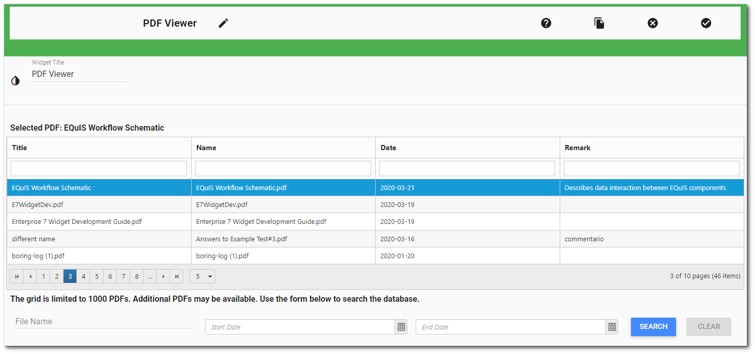
To choose the PDF file to be viewed in the widget, open the Widget Editor by selecting the More Options ![]() icon in the upper right corner of the widget to display the drop-down menu and then select the Edit menu option. The Widget Editor displays a grid containing the 1,000 most recent PDF files in the DT_FILE table and the title of the currently selected PDF file (if one is selected). The grid consists of the following columns:
icon in the upper right corner of the widget to display the drop-down menu and then select the Edit menu option. The Widget Editor displays a grid containing the 1,000 most recent PDF files in the DT_FILE table and the title of the currently selected PDF file (if one is selected). The grid consists of the following columns:
Title |
Name |
Date |
Remark |
|---|---|---|---|
The title given to the PDF file when the file is uploaded or the File Name if no value was provided. |
The name of the PDF file uploaded. |
The date the file was uploaded in ISO format (YYYY-MM-DD). |
The remark given when the file was uploaded. |
The bottom of the grid contains paging controls for displaying a limited number of files at a time, as described below.
Arrows – Use the left/right arrows to navigate through pages.
Go to Page List – Select a specific page to navigate directly to that page.
Rows per Page – Change the number of files to be displayed per page by using the drop-down menu.
Count of Pages and Total Items – This control indicates the total number of files available in the widget, how many pages to display the files, and which page is currently selected.
To facilitate finding the desired PDF file, the grid columns of the Widget Editor can be sorted or filtered.
Sorting – The columns are sortable by clicking on the column header (click again to reverse the sort).
Filtering – To filter the file attributes (e.g., title), enter a search term in the appropriate search box beneath the column header. Only attributes that contain the search term will be displayed.
Searching – Since the database could contain tens of thousands of PDF files, the initial grid display is limited to the 1,000 most recent files for performance efficiency. If the desired PDF file is not displayed in the grid, the file can be searched for by File Name, Start Date, and/or End Date. The grid display will reflect the new search terms. Use the Clear button to remove search terms.
Start and End Dates are displayed in ISO format (YYYY-MM-DD) and are automatically adjusted if a valid date format (07/01/2021 or 07/01/21) is entered in a non-ISO format. The "Search" button will become disabled if an invalid date format or invalid date is entered into the date pickers. The Start Date and/or End Date date pickers will be highlighted in red if a date needs to be fixed. Once the date(s) are valid and properly formatted, the "Search" button will become enabled.
If only the Start Date is populated, the results will be PDF files uploaded after the Start Date provided. If only the End Date is populated, the results will be PDF files uploaded before the End Date provided. If both Start Date and End Date are provided, the results will be PDF files uploaded between the two dates provided.
Once the desired PDF file is found, select the file from the grid to view in the widget. Selecting a PDF will highlight the row and assign the title of the PDF file as the Selected PDF file. To deselect the PDF file, click on the file again in the grid. Saving the Widget Editor with a selected PDF file will display the PDF file when the widget loads.
Widget Properties
Widget Title – By default, the widget title is PDF Viewer. The title can be modified.
Widget Color – The color of the widget can be changed using the Widget Theme![]() icon to the left of the widget title.
icon to the left of the widget title.
Widget Object Editor – To set various appearance properties of the widget, select the Object Editor ![]() icon in the widget header to open the Widget Object Editor. See the Widget Editor article for more details.
icon in the widget header to open the Widget Object Editor. See the Widget Editor article for more details.
Help – The Help ![]() icon connects to the online documentation related to the specific widget.
icon connects to the online documentation related to the specific widget.
Copy Settings – Select the Copy Settings ![]() icon to to copy the settings from another widget of the same type. See the Copy Widget Settings article for more information.
icon to to copy the settings from another widget of the same type. See the Copy Widget Settings article for more information.
Cancel – Select the Close without Saving ![]() icon to exit the Widget Editor without saving changes.
icon to exit the Widget Editor without saving changes.
Save – Changes will be applied to the widget by clicking on the Save ![]() icon. The Widget Editor screen will close after the save operation is complete.
icon. The Widget Editor screen will close after the save operation is complete.
